The interface is organised purposefully to keep similar things together and different things separate. The design and model is apparent and recognisable.
*Consistency
*Explain the rules
*Group things effectively
Tolerance:
The design is flexible by giving the option of backtracking and re-doing as well as allowing varied inputs.
*Align fields effectively
*Justify data appropriately
*Take an evolutionary approach
Photoshop is a good example of tolerance because it allows its user to customise it to be more fitting for the specific tasks as well as giving the back and forth option.
Reuse:
Allows you to reuse internal and external components as well as have consistency with purpose and function keeping the visual design simple.
*Word your messages and labels effectively
*Look at other applications with a grain of salt
*Use colour appropriately
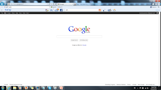
Google is a good example of reuse because it has internal and external components to help find the user what they are looking for. The design is simple to keep focus on the function.
Simplicity:
Is very common and makes repetitive tasks easy because of the simple communication as well as providing shortcuts and hot-keys.
*Navigation between major user interface items is important
*Understand the ui widgets
*Expect your user to make mistakes
Illustrator is a good example of simplicity because everything mainly revolves around the pen tool. There are also shortcuts and hot-keys available to make repetitive tasks easy and fast.
Feedback:
Very clear and communicative with the user and informs of actions, changes, conditions, errors, etc.
*Hold the line
*Follow the contract rule
*Your design should be intuitable
Microsoft Word is a good example of feedback because it has a clear layout of all the options making it easy for the user to understand and use. It provides many actions, changes, conditions, and shows the errors.
Visibility:
All of the options are very visible and simple to not distract of overwhelm the user with redundant information.
*Set standards
*Navigation within a screen is important
*Don't create busy user interfaces
Paint is a good example of visibility because it is a very simple program with all of the tools in view not to overwhelm the user with redundant information.


No comments:
Post a Comment